
Page layout in children’s books is one of the most powerful but least obvious storytelling tools. It affects attention without ever being directly noticed.
Where a character sits on a page it changes how they are perceived. A small figure surrounded by empty space can feel isolated or calm depending on context.
A large figure filling the page can feel confident or overwhelming. Even the amount of empty space plays a role in how a moment is interpreted.
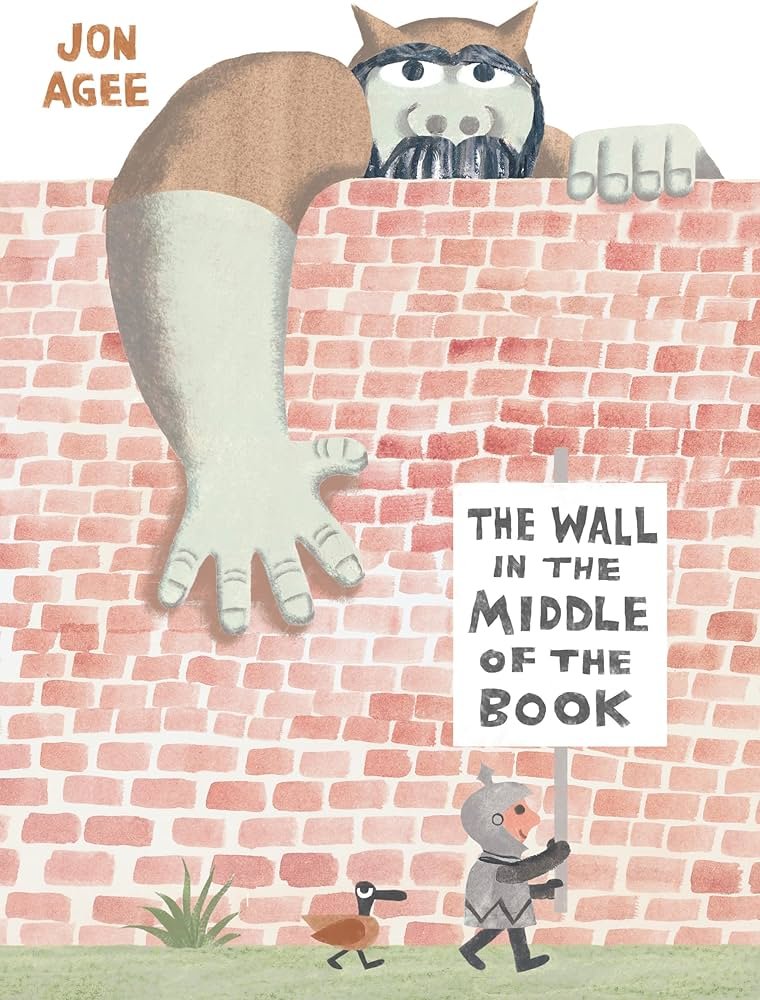
A strong example is The Wall in the Middle of the Book by Jon Agee. The entire structure depends on composition. The wall physically divides the page into two different visual worlds.
One side is structured and predictable. The other side feels more chaotic and alive. The interesting part is that the reader sees both sides while the character only understands one.
That difference in perspective is created entirely through layout. The composition is not just showing the story. It is actively shaping what the reader understands versus what the character believes.
Page turns also play a role in pacing. Some illustrations are designed to build tension right before a page is flipped so the reveal happens on the next spread. That timing creates a rhythm that is physical as well as visual.
Composition is basically invisible direction. It controls how you move through the story without you realizing you are being guided.