
Color does a lot more in children’s books than just make things look appealing. It is usually the first layer of storytelling you pick up on. Even before you fully understand what is happening in the scene. It sets the emotional baseline without needing to explain anything.
What is interesting is how color can change the meaning of a moment without changing the content at all. A character standing in a bright warm palette can feel safe or hopeful. The same character in cooler or muted tones can feel distant or uncertain.
It is a subtle shift but it completely changes how you read the story.
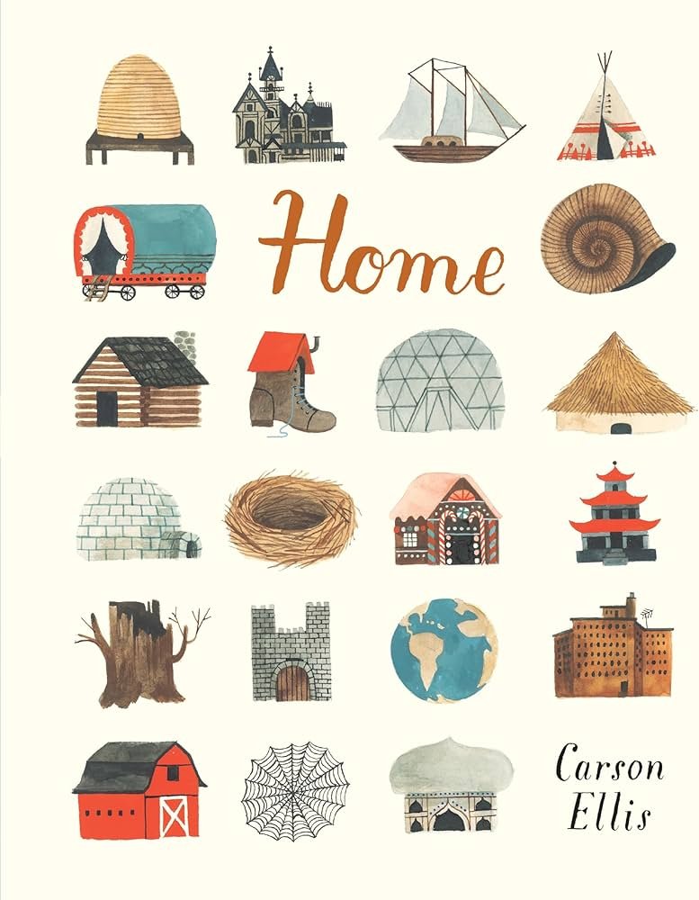
A strong example is Home by Carson Ellis. The book is structured around different kinds of homes, both real and imagined.
The text is minimal so the emotional weight comes heavily from the visuals. What stands out is how each home has its own color identity. The more grounded spaces use earthy greens, browns and soft neutrals which makes them feel stable and lived in.
The more imaginative homes shift into unexpected palettes like washed purples or soft pastels that feel slightly removed from reality.
What is important here is that the color is not just describing the environment. It is defining how real or imagined each space feels emotionally. Even though the structure of each page is similar, the color makes every spread feel distinct.
Color in illustration tells you how to interpret a moment without directly telling you anything at all.